Understanding Peace Through Data
Let the Strong Leader Stay, but Let's Bring in the Experts
Despite the last decade's rise in populism, particularly in Europe and Northern America, the latest results from the World Value Survey Wave 7 point in a new direction.
Paulo's Idea
A short description of the post.
Intro to Peace+Data
A short description of the post.
Visualizing Asset Returns
In this post we take a closer look at the individual assets which compose a portfolio. The motivation is to make sure we have scrutinized our assets before they get into our portfolio, as once the portfolio has been constructed, it is tempting to keep the analysis at the portfolio level
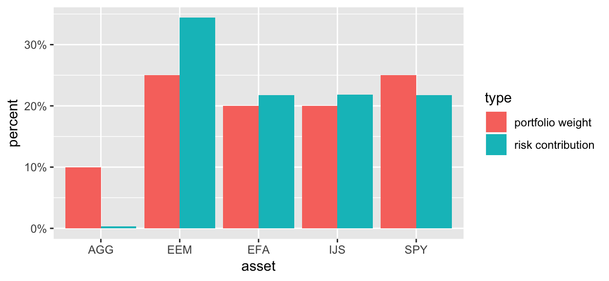
Asset Contribution to Portfolio Volatility
In this post we explore breaking total portfolio volatility into its constituent parts and investigate how each asset contributes to the volatility.
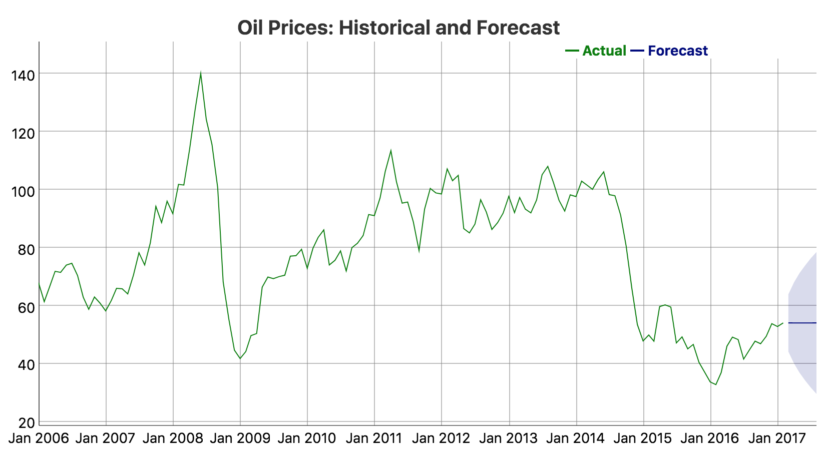
Quandl and Forecasting
In this post, we will explore commodity prices using data from Quandl, a repository for both free and paid data sources. We will also get into the forecasting game a bit and think about how best to use dygraphs when visualizing predicted time series as an extension of historical data.
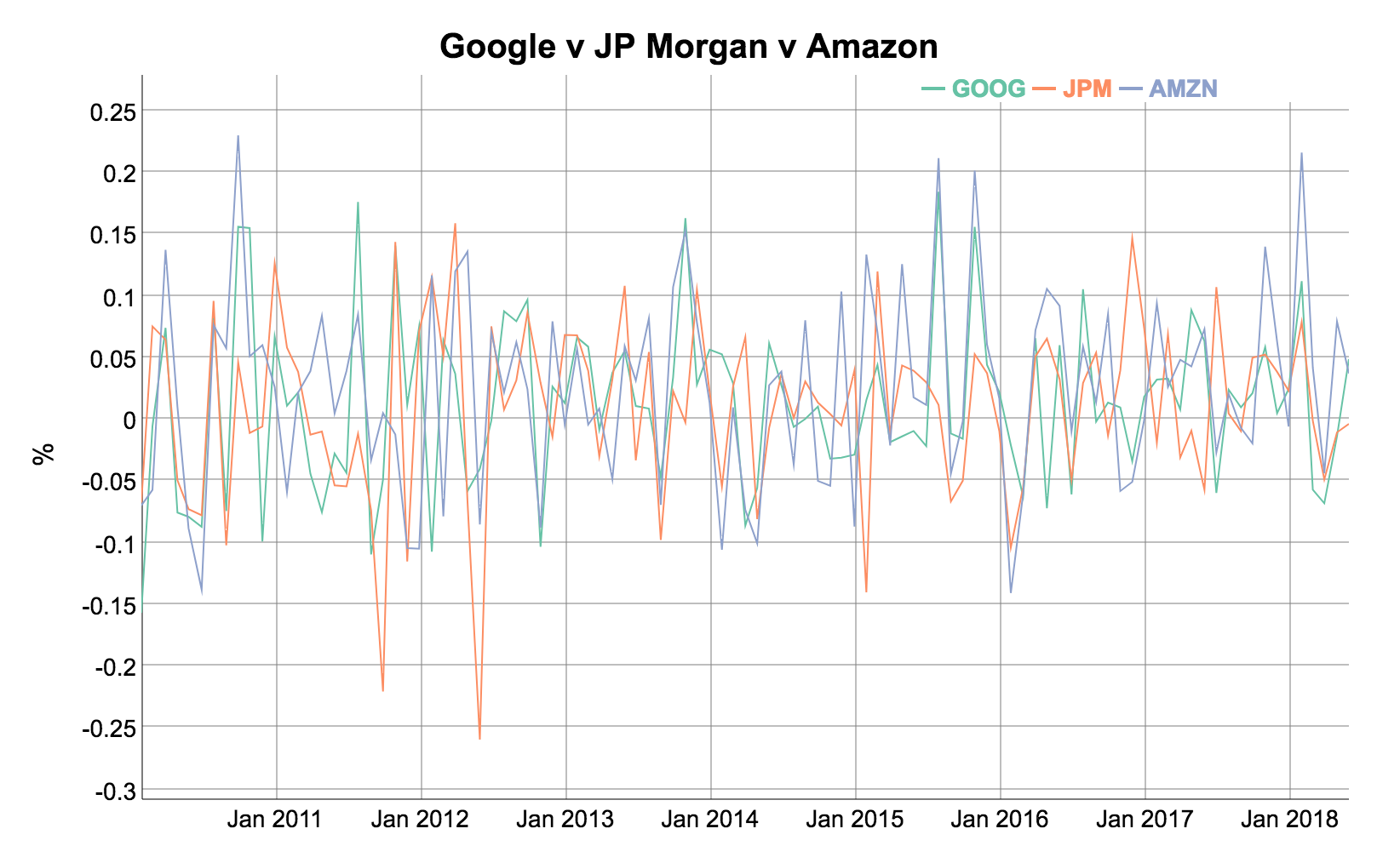
The Sharpe Ratio
In this post we present a classic finance use case using the PerformanceAnalytics, quantmod, and dygraphs packages. We'll demonstrate importing stock data, building a portfolio, and then calculating the Sharpe Ratio.